ROXY/Quiksilver has been a successful surf and clothing brand for over 4 decades. Their logo is brilliant, iconic and gives the audience an “AHA!” moment, that even after being a huge supporter of the brand for years, still surprised me.
The early onset of the Quiksilver Company began to plant its roots in 1969 and took the name Quiksilver. Originally a swan, the company’s iconic logo debuted in 1970: a wave over a mountain. The visual was inspired by Mt. Fuji and a typhoon wave from a Japanese woodblock painting. This is surprising as I had imagined it may have been derived from surfing itself. The deeper meaning of the logo is one of “excellence and authenticity.”
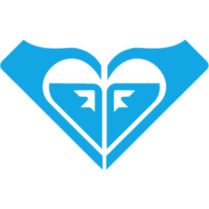
In its current incarnation, Quiksilver is the men’s line of clothing and ROXY is the women’s line. ROXY didn’t get its start until 1991. And it’s logo is a spin off and very much a reflection of the Quiksilver logo. Once you see it, you can’t un-see it:
The ROXY icon takes two Quiksilver logos and places them into the shape of a heart. It wasn’t extremely obvious to see until it was too obvious.
I could not find confirmation of the actual designer of the logo. Wikipedia does mention that the original founders, Alan Green and John Law, were the ones who designed the logo. How this company got its start is not too different from Apple except that instead of a garage, Green used his apartment to prototype surf-wear.
________________________________________________________________
When branding myself, I am very indecisive. It is a huge commitment. Branding. Branding is intense. Just ask the cattle who have to go through it. It’s almost more of a commitment than marriage. That, you can get out of. But once your image and first impressions are out there, you’re branded for life.
Landing on a logo that is suitable for me at this point in time is a bit interesting, as this is this transition point of past Angela to future Angela.
I spent the majority of my adult life in media, Japanese language/culture and entertainment (production and performing). I taught elementary and middle school kids in Japan, and have been trying to get my foot in the door for content creation in children’s educational television (Dear Sesame, I am located at 721 Broadway). But now I am doing physical computing, less performing and I broke up with Japan in 2012. And what happens next?
WHAT AM I? WHERE AM I GOING? HOW CAN I FORGET WHERE I’VE BEEN?
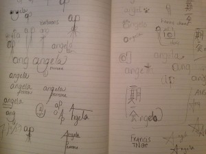
I originally thought that I would use my first name only, all in lowercase. I wanted to use the font I made where I had the little round serifs at the line points.
However, that didn’t seem to capture more than just my childlike spirit. Then I thought, okay, keep the lower case first name, add the comedy. My name was easy to turn into a happy face. This was the go to for a bit.
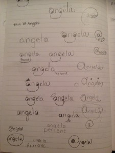
However, that was too generic and kid like, the comic sans of logos. Scratch that. Next. Keeping with the childhood theme, I tried out some ideas making my name into balloons. But that did not seem to represent anything about the brand of myself that I want to push forward. I started adding in my last name and also trying out initials and avoiding the Associated Press logo (–they seem to have changed their logo since I left the news world). I also made an effort to include a microphone into my name to represent the comedy aspect. But that is not 100% of who I am either. (I did prefer the old school style mic, as I am an old soul and that is more my style.)
Next I thought of the most meaningful Japanese idiom, that has influenced me over the years – 4 character phrase in Japanese – 「一期一会」which essentially translates to ” cherish the one chance encounters/opportunities that you have.” But this is just too much of one aspect of my past and does not say enough about now and where I am headed. 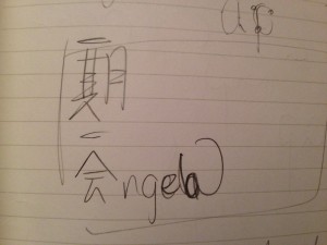
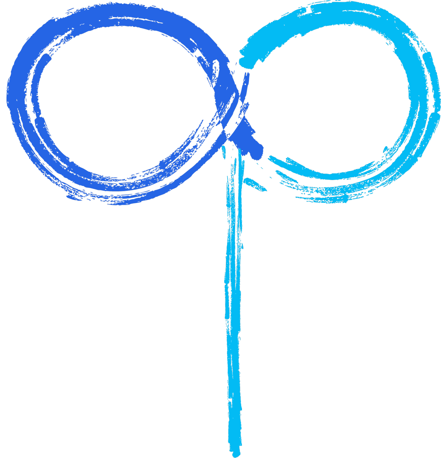
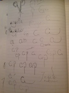
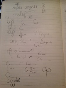
And then I started to focus on my initials next to each other and liked how the bowls of the “a” and “p” mirrored each other off of the descender of the “p”.
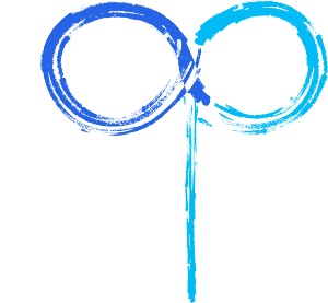
And then I landed on my final idea – to transform my initials into an infinity symbol, the “a” leading into the “p” with a subtle color transition. The infinity being that anything is possible – “If you can dream it, then you can do it” – Horizons, EPCOT. I am capable of many hats. And also it represents the idea of something that was told to me by a wise* old woman in Japan, 「人生は死ぬまで勉強。」Translation: “Life is about learning until you die.” So this captures the essence of that. Also I love blue. The stroke was chosen because it keeps to that hand-drawn look that I wanted from the start, and has the echoes of Japanese calligraphy. Somehow the strokes have a gorgeous ebb and flow, and even the descender ends without a distinct end, as if to show that nothing is quite complete.
*In retrospect this woman may have suffered from some sort of dementia. Over the course of my time on a small island in Japan, she had taking a liking to me. And she was very nice. However…She would visit the Board of Education (BOE) and insist on seeing me. I came to the office once to find her sitting in the boss’s chair at his desk. She had a box of hats and shirts that she also insisted that I try on. Right then and there. Another time she forced me, my Canadian colleague, and the boss (the head of the BOE) to go to her house during the work day. Why we couldn’t say no is still a mystery. But she did say that phrase to me. It is something I do hold dear to my heart and will never forget. It was the most true thing anyone has ever said.
IM NOT DONE YET
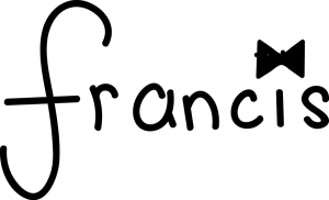
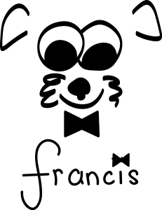
I spent the last 14 months building a brand for my dog Francis. His namesake is Frank Sinatra, so when coming up with his logo, it needed to have some sort of reference to Ol’ Blue Eyes. I thought I would take advantage of this assignment and use it to digitize his hand drawn logo. It is in two parts, both word mark and Icon, that can be combined together.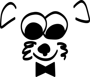
BONUS LOGO
TNO is great…in theory. But in practice it is absolutely mad. To start partying at 11pm on a Thursday 3 or 5 years ago, I would say yes, definitely. But now, 11pm is when I want to be in my bed with Rose, Blanche, Dorothy and Sophia talking about Sicily and St. Olaf. So a friend of mine suggested having a TNO on Thursdays that started at 6pm, for those who prefer to call it a night while it is still that night. I suggested…”TNOw!” And of course I had to make the logo – because I will do anything to to follow through on a bit.


Leave a Reply