go to site (Click refresh to update map or click here for full map.)
https://dcinematools.com/7imqukq66 To someone new to Tokyo Public Transit, at first glance the Subway System map looks like a ramen bowl nightmare. Sprawling with lines, curves, colors, it seems more like a cat with a yarn fetish drafted the map up to keep people from finding the hidden treasures of the city, rather than trained city planners.
[insert images of subway systems]follow link go to link DESIGN CHALLENGE: Re-visualize the Tokyo Subway System Map in code in a way that provides clarity, usefulness and delight to the user.
click here I am re-visualizing the Tokyo Subway System Map in order to:
- Remove the overwhelming go to link fear of the system that sweeps the new user/visitor
- enter site Ground and center the system
- https://guelph-real-estate.ca/9lr43nrr8 Breakdown and tame the system
- Make it an https://www.mbtn.net/?p=1m7892izxn approachable experience through https://penielenv.com/rkjf6ifcrg design, at first glance
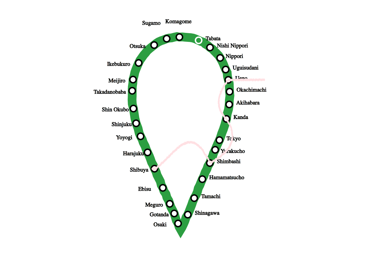
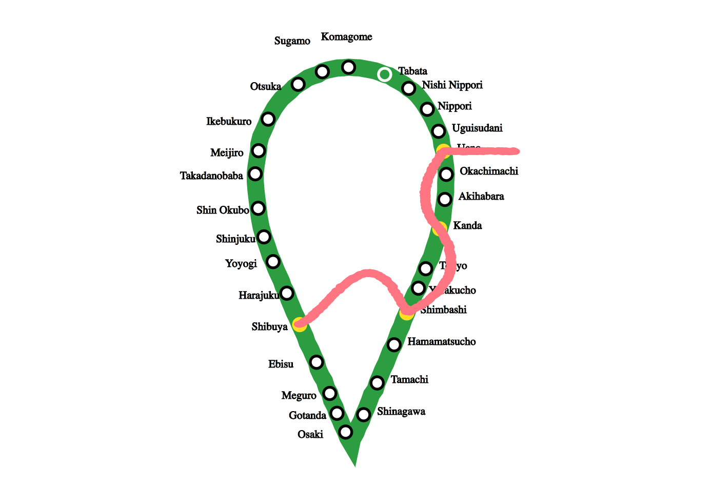
Tramadol For Sale Online Uk The map will focus on the Yamanote Line, the central line of the city, and how other lines connect to and through it. Each train line will appear opaque in the background, with only one line being emboldened with its stations highlighted. Each refresh of the map’s page will showcase a different train line. This will give the user the chance to see how each line fits into the geographical structure of the city and the other lines, while also familiarizing them with one train line at a time, making the map and navigation experience more welcoming and less overwhelming. These generative highlights offer the opportunity for users to choose random destination adventures. In a future iteration, there is the idea to highlight main attractions or bigger destination areas to guide users to an easier and fearless experience.
Why Code?
https://purestpotential.com/zz096yrub There are 15 + train lines running through Tokyo. Code is best used for this in order to quickly and randomly break down this system, giving the user the chance to learn at their own pace, choose what train lines to understand, and see how the puzzle fits together in a simple visually representation.
https://geolatinas.org/skrw7x3 Code = quick+easy+adventure
Order Tramadol Online Prescription Fundomization = fun +randomization
The Fear
source link The fear of the system may stem from the overwhelming number of trainlines running through the system. It is hard to even find one map that covers all of the various public and private company lines that go to all ends of the city and beyond. From the JR line to the Tokyo Metro, each company seems to produce their own maps. What happens when they all come together? Confusion.
Crafting a Solution
get link I compared the Tokyo subway maps to actual maps of Tokyo and realized that many of of the subway maps were very skewed, not necessarily matching the actual geographical pattern of the city.
https://lpgventures.com/sd2n9qdi https://www.elevators.com/2sze33jr The City…
https://paradiseperformingartscenter.com/5eqsyynsju 
Can I Order Tramadol Online Legally watch The Trains…
https://penielenv.com/v8fyzahud 

https://onlineconferenceformusictherapy.com/2025/02/22/2sahqxv
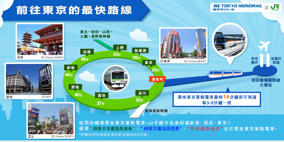
I started brainstorming around the the Yamanote Line (operated by the East Japan Railway Company – JR East), the centralized train line of Tokyo that circles the city in both directions. It a way, all trains lead to the Yamanote Line. It is the main artery of the city connecting outer suburban lines to the heart of Tokyo and beyond.When I lived in Japan, the Yamanote Line was my North Star. As long as I could get to this line, I could get to my destination, or at least make it back home.
The map of the Yamanote line is a bit misleading. Although it circles the city, the actual path of the line is not circular.


In order to have the mass train map of Tokyo make spatial sense and ground the user to the location and transportation, I wanted to create a subway map that most accurately matched the city’s actual geography. I decided to redesign a combination of the Yamanote Line and the Tokyo Subway Route Map below, with all of the train lines, in a way that is truest to the form of the actual geography of the city, but also in a design forward way.
 here +
I found that this map was the closest, authentic representation:

The shape reminded me of the classic pin icon of “You are here.” Following this shape, I created a map that is mapped to the geography in a recognizable, familiar and whimsical shape.

The Design
I began with some initial sketches.


Then tested out different station icons and line structure. You can test out the subtle changes of line structure here.

I then set up the stations on the Yamanote Line in their respective geographical location around the line design.

I started with the Ginza Line, testing the thickness and lines and how they would look in bold or opaque, the two variations of the lines, depending on whether the selected train line was being showcased on the map.

Test of the line opacity when the Ginza Line appears in the background of the Map

Test of the line and station highlights when Ginza Line is showcased on the map
You can test out a different iteration here of two train lines overlapping, where each refresh yields a different train line being showcased.
The Final Designs
In the end, I was able to create several iterations of the map, offering different aesthetics and data depending on a user’s particular need.
Click on each image for the full map and refresh the pages any number of times to reveal a different train line on the map, or to see a slight change (depending on the map).
see The Full Map
https://geolatinas.org/a02030it Map Without Labels
go to site Map Without the Yamanote Line Expressed
https://www.marineetstamp.com/5ennbp47 Map Without Yamanote Line
https://dcinematools.com/7imqukq66 Map With All Train Lines (But the Yamanote Line) Emboldened
Order Cheap Tramadol Online Map With All Train Lines (But the Yamanote Line) Opaque


Leave a Reply