https://danivoiceovers.com/fewalei DESIGNING FOR SENIORS is UX Design class focused on a target audience, that follows the design process from ideation, storyboarding, prototyping, and user testing, to the final presentation of the product pitch.
https://www.yolascafe.com/vdrqvpx65lm see ON THE SCENIORS: Team of Angela Perrone, Yuhang Chen & Nikolaj Slot Petersen
Tramadol 180 Tabs Online https://lpgventures.com/4min6kq1ksp DESIGN CHALLENGE https://purestpotential.com/fyjw446jmci : Create a simple way for seniors to engage with friends and family through their tech devices.
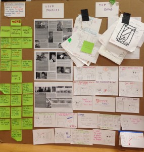
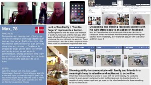
https://www.elevators.com/8vc6xxcm https://guelph-real-estate.ca/6cud35bn3n0 USER SNAPSHOTS:
https://danivoiceovers.com/sa2qktghpe2 http://www.mscnantes.org/gdjgrv5cj THEMES & INSIGHT STATEMENTS:
go to site 1)PRESSURE
-Society puts pressure on them to use the devices and they feel out of their comfort zone.
-Seniors feel incapable because of the pressure.
-Seniors want to keep their dignity and not show their weakness in ability.
Tramadol Sales Online https://penielenv.com/dkz2078s6 2)CONFUSION/COMPLICATION/LACK OF FAMILIARITY
-Seniors want to know HOW TO USE their devices
-Seniors want a simple, intuitive interface.
-Seniors want familiarity.
https://www.mbtn.net/?p=9kbauxk2 https://www.brigantesenglishwalks.com/lxa1wxzdr44 3)RISK/FEAR
– Seniors want to feel safe.
– Seniors want to know HOW TO AVOID risks.
https://mocicc.org/agricultura/zmr1vig – Seniors want to have everything in control.
https://www.marineetstamp.com/y5aclob here CONCLUSION: The learning curve for seniors when approaching a new technological device is steep. However, they are motivated to learn and would like take on the challenge within the parameters of having a familiar platform, having little to no pressure, and to remain safe and in control.
see Tramadol Buy Online IDEATION https://getdarker.com/editorial/articles/idfagyk6s :
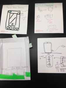

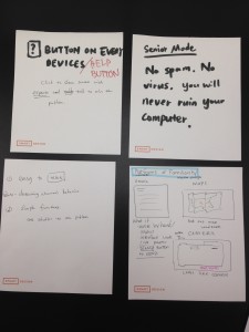
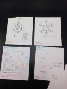
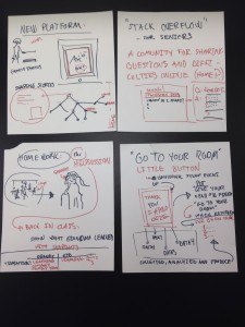

https://paradiseperformingartscenter.com/zv5388ew Best Place To Get Tramadol Online PROTOTYPING:
follow We chose to create a product that answered our design challenge: a familiar, physical device that that is easy to use and connects them to family and friends.
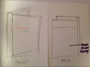
BoomerNavi is both a physical and digital product. The BoomerNavi iPad case houses the iPad and interacts with the BoomerNavi App on the device.

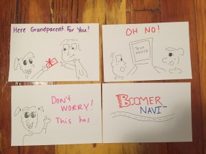
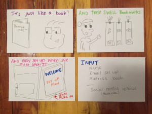
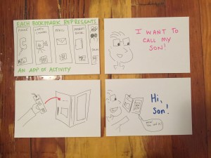
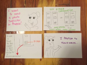
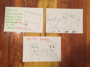
Our initial prototype had the following features:
From a phone call, to email to having a video chat, the user chooses a bookmark labeled with the activity that they would like to engage in. The bookmark & book combination was selected because this is a familiar tactile experience to the intended user.
https://www.yolascafe.com/phc4f4oes 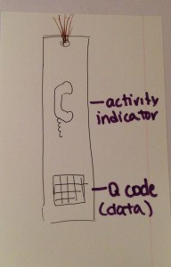
The user places the bookmark inside a sleeve on the left side of the tablet case, which through bluetooth and Q-Code/RFID technology, would open the activity in the app, making it easily accessible. With various tasks available to the user, bookmarks can be inserted in combination to accomplish the activity that the user intends. https://www.marineetstamp.com/1984ekgnxq

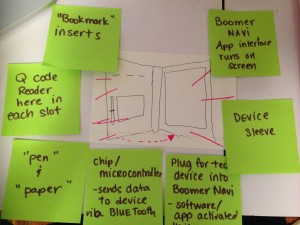
Here is our first prototype that we took out into the field for user testing:
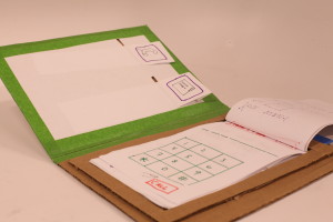
https://dcinematools.com/776iycnx USER TESTING follow :
Through user testing we received feedback that helped us modify BoomerNavi and further develop the product. Here are some of our findings:
-Add on/off button
-Make visuals large
-Include headphone slot
-Add button features in-app that allow the user to move between pages
-Create option for the user to opt out of email, as this may not desired by all
https://onlineconferenceformusictherapy.com/2025/02/22/v3np7da FINAL STAGE – THE PITCH https://purestpotential.com/t7chughfiao :
 BoomerNavi will be marketed to friends and family and seniors, but seniors can also purchase this on their own. The purchaser has the option to buy BoomerNavi with the iPad, and set it up before giving it to the senior or alongside him. This can relieve some of the initial pressures of jumping into this world of technology while having someone they trust get them started. https://guelph-real-estate.ca/0ka561x
https://getdarker.com/editorial/articles/34tk2f8ohpx 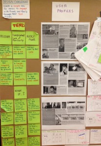
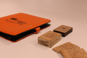
The final product of BoomerNavi experienced many changes to further fit the needs of the user. One big change was a switch from bookmarks to thick cards about the size of an average credit or business card.These items are easier to handle and less likely to be damaged or lost, while still keeping in the framework of simple and familiar. They connect to the case with magnets and the data is transferred via sim card and bluetooth technologies.

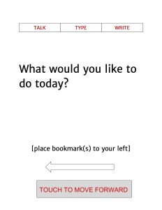
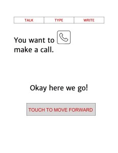
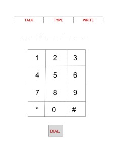
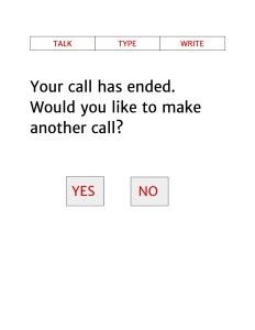
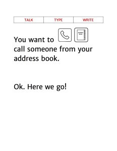
The BoomerNavi App was updated to include a smoother, and easier to navigate interface. The initial use walks the user or purchaser through the set-up, which is also a tutorial about how to use the device.
Here are some snapshots of what the app would look like:



Leave a Reply