I spend hours and hours choosing the perfect font for any project, card, letter, photo edit that I do. It’s even harder trying to find the typeface that best express oneself. So I thought I would start here.
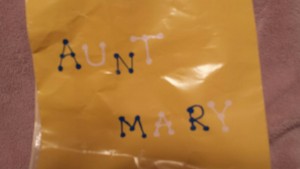
When I was a child back during the times of pens, paper and the “By Hand” mail days, my mother would always use her own special typeface for invitations and would insist that I follow suit. It was a child-like handwriting and on each letter she would create her own decorative serif by adding little round bulbs at the terminals, at the tips of the arms, legs, the stems, the chins, the crotch, and at the points where a crossbars would intersect the rest of the letter. This typeface, I would say captures me best, as it reflects my colorful energy and appreciation for my youthful days.
It was hard to find this font so I had to do some editing to turn a sans serif into this sort of serif. I used KG Miss Kindergarten as the base sans serif and added on the bulbs to the existing font. The kerning seemed a bit tight, so I also spaced the characters out a bit as well.
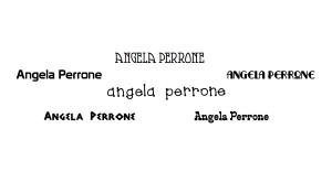
Smorgasbord shows a classy, throwback to the silent film era, which is a time period and a cinema genre that have been themes in my life. All of the letters in this typeface are the ascenders. The bowl of the rounded characters are all tall, egg-shaped. The serifs on the top of the tops of the “E” and the “F” are so close together that they appear as though they form a square bowl.
The Edmunds typeface is playful, reminiscent of trains and the “Laugh-In” logo mixed. Quite the combination, but makes sense. The bowls, arcs, arms and legs are all very curvy and round, supported by the stiff and sturdy stems.
Prototype is a sans serif designed after the old Epcot typeface. Epcot is where I spent most of my weekends and summers during middle school. My experience at Epcot was one of the reasons that inspired me to come to ITP. The stems and the edges are all very rounded. The arcs are rounded instead of pointed, giving the typeface more flow than the ones with the pointed arcs.
Another sans serif I chose was Adonais. This typeface is adapted from the original Caesar’s Palace logo. My father worked here for 39 years and whenever we would visit, Ceasar’s Palace was like a second home. It’s a typeface that I often tried to recreate when writing. Contrary to Prototype, the arcs, heads and tips are all angular and pointed.
And finally I chose RitzyRemix, another vintage style font, as these are the decades that I relate to best. It’s a throwback to silent film meeting old Hollywood and cinema, at the juncture of when talkies came into the picture. The arcs are and stems are a mixture of round and pointed. The upper case characters were more pointed, which is why I chose to use the lower case “A” instead of the upper case. It was more fitting and more flowing.
_______________________________________________


Leave a Reply