Once you start consciously observing the signage that covers 95% of the surroundings in NYC, you can’t un-see it all. You enter this rabbit hole of visual stimulation and you can’t help but notice every little marking. Some good, some bad, some you could do without. Here are some that I cam across this week.
THE GOOD
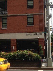
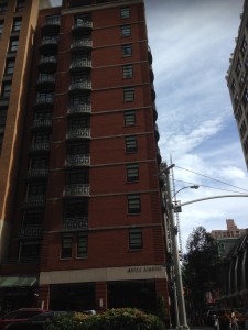
I really enjoy the story told by this simple logo and the name of this hotel. The font is long and narrow, reminiscent of its namesake, the giraffe. If you actually zoom out and look at the building, structurally it looks like a giraffe as well – long, narrow, with lines blocks of windows, much like the spots on a giraffe. Together, the sign and the actual building tell the same story perfectly.
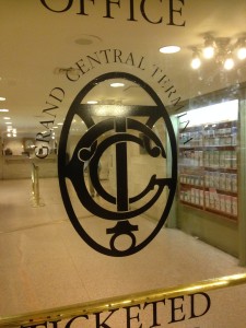
Besides the Statue of Liberty, one of the most sacred, historical places in New York City (in my eyes) is Grand Central Terminal. Grand Central is a magical place. It reminds me of the past, times of my childhood when my mother and I would pass through from Connecticut on our way to see FAO Schwartz, meet Santa and see Sesame Street Live. When I go back home to CT, I thank the stars painted on the ceiling that Grand Central did not meet the same tragedy as Penn Station. (RIP, Iconic Structure.)
The logo recently changed for the centennial, but remnants of this classic image still remain within the walls of the station. It looks like the direction that the designers were given for this project was, “Fit as much as you can into this circle and don’t color out of the lines.” In the center are G, C, T in an old fashioned, turn-of-the-century train font. It seems to be a mix of Fontleroy meets Epique. The G might not be 100% clear, but once you realize it is GCT woven together through the T, which looks like some sort of post (which I assume has something to do with trains), it makes comes together in a perfect, circular marriage. The logo keeps going around and around, much like the trains keep coming there and back and there and back. The logo is grand, it is central in the circle, around the stationary “T”. The other font for “Grand Central Terminal” appears to be in Times New Roman.
Classy sign for a classy place.
THE BAD
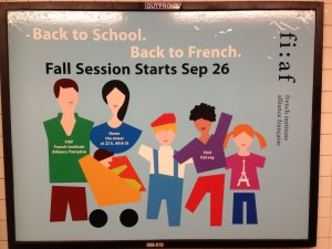
French Institute Alliance Francais
This sign is so noisy and takes forever to figure out exactly what it is advertising and the organization that it is referring to. Right away you know it is about studying French in some capacity. But who, where, and why require some detective work. During a hectic commute, you might not have the time to get all of the answers. AD FAIL. The name of the organization requires you to turn your head sideways. First it is there in its logo/acronym form. To the average person, fi:af is not yet a household acronym like ASPCA or ACDC. Further over, we see it’s name in smaller print which makes the actual name seem insignificant. Ugh. I am already annoyed with this and I barely know anything about it. Meanwhile, each person is wearing bits of information on their clothing with even more small tidbits scattered about. Forget it. I am going to stand here, sip my coffee and read up on the latest happenings on…oh wait the train is coming. Farewell forever, FIAF.
This sign for SeatGeek.com isn’t terrible. I just find it interesting that they sat the child next to the only adult drinking alcohol. But I guess it was better than putting her next to the creepy old man with the beard. Not the best options for her.
This sign does use the simple character artwork that many new ads feature nowadays including Oscar Health Insurance. It makes me wonder if this is the new trend with characters (like manga is with the specifics of the character art) or if theses all have the same parent company.
The complexity of words, colors, fonts, sizes, thicknesses on this sign seem to correlate to the not-so-easy access to the free wifi. NOTE: the “BNE” marking is graffiti, so we can’t fault the sign for this added chaos. And when I am running down the steps into the subway, I am definitely not going be able to stop, open up my settings feature on my phone, search for the SSID input, and wait to connect. Also, SSID sounds complicated. Why can’t I just connect to “FREEMTAWIFI” and it not require a password at all. By the time I log in, the train will be there (not that MTA trains are on time or come when you want them to, they always seem to come when you find something to occupy your time with). The “Transit wireless” wording needs to be eliminated, the WiFi logo moved over, and the access needs to be easer. Also the sign needs to be in the subway, not in the line of fire on the steps.
THE REVAMP
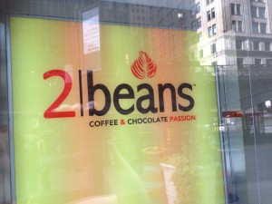
I found this coffee shop in the city and although the logo is clean and pretty, and I generally like it, I had trouble with what story it was trying to convey.
Is this cafe called “21 Beans,” with 21 styles, like Baskin Robbins has 31 flavors? Or is it called “2 Beans” because it refers to coffee and chocolate? The latter option makes more sense, as much as I would love 21 different flavors of coffee.
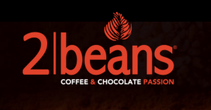
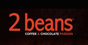
How do we make this sign convey its story in a clearer fashion? First I removed the middle line completely. It really had to go. It does nothing but add chaos and confuse the story. Next in line was the extraction of the dollop above the “a.” It is a reflection of the art that they make with the cream/foam on their beverages. Cute idea. A bit obscure.
Without these sign looks a bit unfinished. So I decided to add into it the actual story of the two beans. In keeping with the simple theme and colors, I created the two beans (one coffee, one chocolate) in place of the “|” in the image. They tell a much better and clearer story, I think, than the dividing line and the dollop.
EXTRA EXTRA
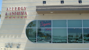
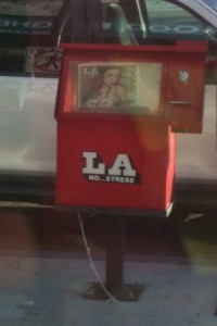
Over 5 years ago I began collecting photos of really absurd signage. These three images come to you from my time in Los Angeles, and show the bad very well.






Leave a Reply